Published – last updated – skip to updates
Pretty and random animated blog post images
ooo pretty... what do you think?
Skip to the bottom to see the examples! But check your “Reduced Motion” system settings first!
I recently made a small change to my blog list page by showing images in the list, to provide a clearer identifier for posts you may have already read. But not every post has an image, so what could I show for a default? Ooh, how about a random gradient?
Well, I searched for “random background gradient” on duckduckgo.com, and found someone who was randomising 141deg linear-gradients from a combination of 4 colours. I thought “ooo, that looks nice!” so I unashamedly copied the 4 colours and the 141deg 🙈 CSS is free, right?? I then combined them into their 12 pairings and tried them out.
Then, for dark mode, I used VS Code’s excellent built-in colour picker that appears in front of every colour written in a CSS file to darken each colour. After some tweaks, I then had (what I think is) a pleasant pairing of 8 light and dark gradients to use as a default image in my blog list 😌
It’s worth mentioning again: StackOverflow has problems. Also, I tried to find an active account of the user from whom I copied the colours so I could credit them, and all I could find was a GitHub account by the same username. If anyone knows them on something like Twitter, please let me know so I can thank them!
Can CSS be random? #
Well… unfortunately not 😔 If you search for it, all you’ll find are answers like “you can use JavaScript!” which, like, yeah sure, that’ll work! Or “LESS or Sass can preprocess your CSS, so you can randomise when it’s compiled” and, yeah that’s also true!
So what’s my problem then?
Well, this website is built on GitHub Pages (which is Jekyll with an uncustomisable set of plugins), so it’s compiled when I push code changes to my repo. If I used a preprocessor, I would have to run it locally and commit the compiled CSS. As explained in another post “I’m not hating on frontend frameworks”:
I wanted to keep my website free of a frontend build step, so I could write and commit HTML, CSS, and JavaScript anywhere at any time. This is a Jekyll site, but that compilation is handled for me by GitHub Pages, so I can commit via git or the GitHub file editor.
I want to write anywhere at anytime on any device, and a preprocessor makes that more difficult. Also, I just like sticking to plain CSS: it forces me to think more practically when I can’t put functional stuff like loops or maps into it 😇
To be honest, I still haven’t used CSS Custom Properties (or variables)!! 😱 Maybe when I make a light/dark mode toggle? 🤔
So I used JavaScript, right? ❌
Why not? 🤷♀️
On with the code!
CSS #
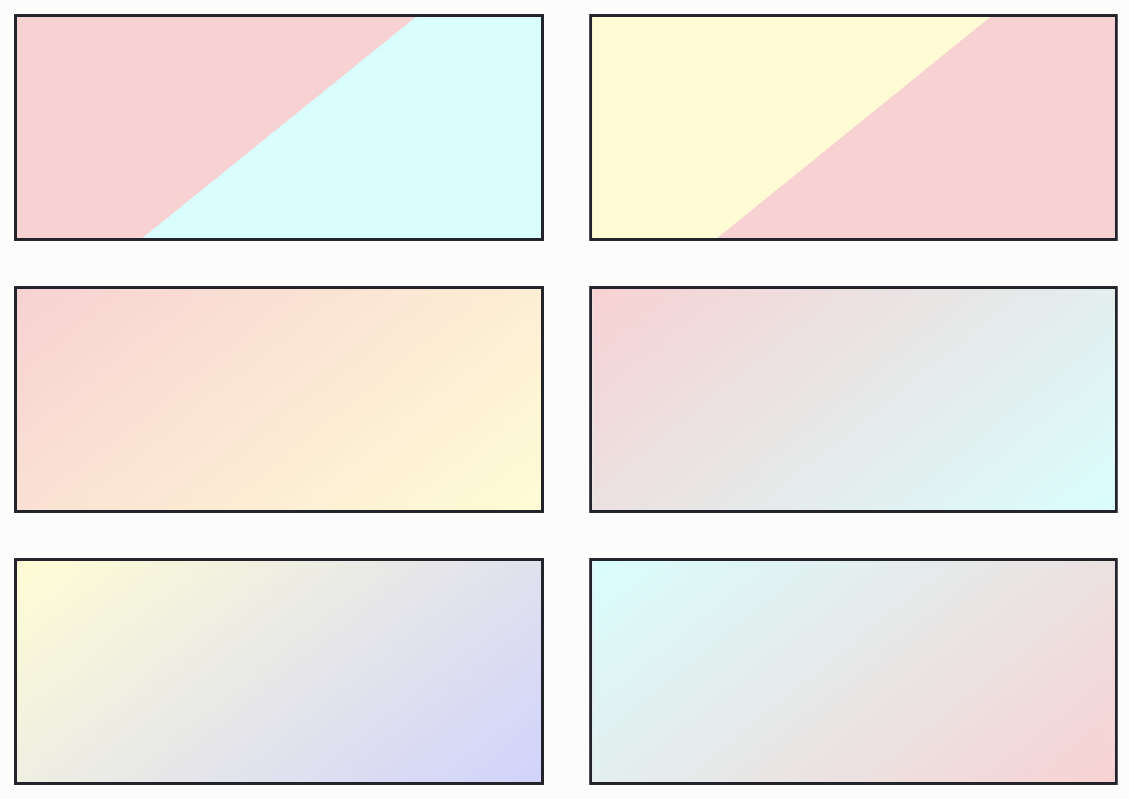
So this isn’t really random. Instead, I made 8 pairs and applied them to the blog posts by array index using modulus, so position 1, 8, 16 is the first one; 2, 9, 17 is the second; and so on.
.random-gradient-0 {
  background-image: linear-gradient(141deg, #ffd0d2 50%, #fffdd0 50%);
}
.random-gradient-1 {
  background-image: linear-gradient(141deg, #ffd0d2 50%, #d0fffd 50%);
}
.random-gradient-2 {
  background-image: linear-gradient(141deg, #fffdd0 50%, #ffd0d2 50%);
}
.random-gradient-3 {
  background-image: linear-gradient(141deg, #fffdd0 50%, #d0d2ff 50%);
}
.random-gradient-4 {
  background-image: linear-gradient(141deg, #d0fffd 50%, #ffd0d2 50%);
}
.random-gradient-5 {
  background-image: linear-gradient(141deg, #d0fffd 50%, #d0d2ff 50%);
}
.random-gradient-6 {
  background-image: linear-gradient(141deg, #d0d2ff 50%, #fffdd0 50%);
}
.random-gradient-7 {
  background-image: linear-gradient(141deg, #d0d2ff 50%, #d0fffd 50%);
}

@media (prefers-color-scheme: dark) {
  .random-gradient-0 {
    background-image: linear-gradient(141deg, #962d48 50%, #e08f0b 50%);
  }
  .random-gradient-1 {
    background-image: linear-gradient(141deg, #3b9e02 50%, #0579a7 50%);
  }
  .random-gradient-2 {
    background-image: linear-gradient(141deg, #e08f0b 50%, #962d48 50%);
  }
  .random-gradient-3 {
    background-image: linear-gradient(141deg, #e08f0b 50%, #4147b4 50%);
  }
  .random-gradient-4 {
    background-image: linear-gradient(141deg, #0579a7 50%, #3b9e02 50%);
  }
  .random-gradient-5 {
    background-image: linear-gradient(141deg, #0579a7 50%, #4147b4 50%);
  }
  .random-gradient-6 {
    background-image: linear-gradient(141deg, #4147b4 50%, #e08f0b 50%);
  }
  .random-gradient-7 {
    background-image: linear-gradient(141deg, #4147b4 50%, #0579a7 50%);
  }
}
HTML (Jekyll) #
Looping in Jekyll is done like so:
{% for post in posts %}
{% endfor %}
To get the index of the loop, you can use forloop:
{% for post in posts %}
  <div class="random-gradient-{{forloop.index0}}"></div>
{% endfor %}
And now to modulus the index so it goes from 0 to 7:
{% for post in posts %}
  <div class="random-gradient-{{forloop.index0|modulo:8}}"></div>
{% endfor %}
Result:
<div class="random-gradient-0"></div>
<div class="random-gradient-1"></div>
<div class="random-gradient-2"></div>
<div class="random-gradient-3"></div>
<div class="random-gradient-4"></div>
<div class="random-gradient-5"></div>
<div class="random-gradient-6"></div>
<div class="random-gradient-7"></div>
<div class="random-gradient-0"></div>
<div class="random-gradient-1"></div>
…
Get it? …? Like … 😅 html humour y’all!
Animation #
First things first: some readers have vestibular motion disorders that can cause problems for them when presenting with motion graphics. As web developers we must design our sites to be accessible to all users.
If you weren’t aware yet (we’re all learning 😇), CSS Trick’s article “An Introduction to the Reduced Motion Media Query” explains:
Vestibular disorders can cause your vestibular system to struggle to make sense of what is happening, resulting in loss of balance and vertigo, migraines, nausea, and hearing loss. Anyone who has spun around too quickly is familiar with a confused vestibular system.
Knowing that, my first animation choice was a simple fade from colour to black and white. Nice and easy. Totally fashionable in The Year Of Our Furby 2020.
.random-gradient {
  transition: filter 400ms ease-out;
}
.random-gradient:hover {
  filter: saturate(0);
}

/* And for the dark mode colours, adding a bit of contrast for punch */
@media (prefers-color-scheme: dark) {
  .random-gradient:hover {
    filter: saturate(0) contrast(1.3);
  }
}
Then, when the user has not set a preference for reduction of motion, I wanted to do a kind of “swoosh” that makes it feel the content is coming in from the right. After fiddling with background-size and background-position, I came across something that works quite well with a rectangle 160px tall and between 350px and 700px wide:
@media (prefers-reduced-motion: no-preference) {
  .random-gradient {
    background-size: 100%;
    background-position-x: 50%;
    transition-property: filter, background-size, background-position;
  }
  .random-gradient:hover {
    background-size: 200%;
    background-position-x: 150%;
  }
}
I liked this motion so much, I applied it to the actual blog images too, so they animate the same way 💞
The Mozilla Developer Network page on prefers-reduced-motion explains how Firefox determines this setting based on your operating system. As far as I can tell, this is the same for other modern browsers (Internet Explorer is no longer a modern browser, sorry! No support for IE 11 or below!). Unfortunately, support is unknown on the UC, QQ, Baidu, and KaiOS browsers (thanks to caniuse.com’s info for CSS at-rule @media prefers-reduced-motion): in those and IE 11, the motion animations will simply not apply. I prefer to “progressively enhance” motion animations, i.e. add when allowed, rather than undo when unwanted.
Please check your system settings if you think you might have problems – there are LOTS of animations below that are trigged by hovering your cursor.
What do you think? #
Here is the full range of light- and dark-mode pretty random animated blog post default images that are comfortable and nice and random and all here right here for you yayyyy!!! 🙌
I’ve also duplicated each set and removed the linear-gradient stops (positions) to get a smooth gradient instead of a hard angle line, and I think those look nice too! But then the motion animation, that transitions background-position-x, still shows a hard vertical line, so I’m not so sure about using the soft ones 🤔
What do you think? Blurred or not blurred? Let me know with the “Reply” link(s) at the bottom 🤗
Updates #
2021-06-16 #
Since implementing the hard-stopped gradients, I’ve realised that I much prefer “less” over “more”. So I’ve switched to the soft version and removed the movement. Now, for a hover highlight, I’ve just increased brightness with a filter. Much simpler and still very nice and comfortable and lovely and random and pretty yayyy 🤗